Create better reusable components for your Tailwind design system
I am front-end developer from Gujarat, India.
In this tutorial, we're going to build a reusable component using Tailwind CSS for a custom design system. To begin with, we'll need a basic Vite.js setup with React, TypeScript, and TailwindCSS or you can also use Nextjs setup.
We need to install a few libraries like tailwind-merge, clsx, and class-variance-authority by running the command given below in the terminal in your project directory.
yarn add tailwind-merge clsx class-variance-authority
// or //
pnpm i tailwind-merge clsx class-variance-authority
Let's understand those libraries first
tailwind-merge: It's a Tailwindcss utility class for merging multiple tailwind classes into a single string without style conflicts. For example:
  import {twMerge} from 'tailwind-merge'

  twMerge('px-2 py-1 bg-red hover:bg-dark-red', 'p-3 bg-[#B91C1C]')
  // → 'hover:bg-dark-red p-3 bg-[#B91C1C]'
clsx: It's a utility for constructing className conditionally. So by using this, you can write conditional classes in a better and more readable way. For example:
import {clsx} from 'clsx' clsx('foo', true && 'bar') // -> 'foo bar' clsx('foo', false && 'bar') // -> 'foo'class-variance-authority: this will help you with writing type-safe UI components and gives you an easy-to-use interface to define variants. It's more like stitches.js but for people who want to use custom CSS or want to use frameworks like Tailwindcss.
Configuring our utilities
As previously discussed, clsx and tailwind-merge help to write readable and maintainable tailwindcss classes. We create a small utility function called cn that we will use later for our components.
// src/utilities/index.ts

import { twMerge } from 'tailwind-merge';
import { ClassValue, clsx } from 'clsx';

export function cn(...inputs: ClassValue[]){
    return twMerge(clsx(inputs));
}
In this file, we have imported two functions twMerge and clsx. Where this function takes input as an array of ClassValue type. This input is passed to clsx function which outputs multiple classes and then twMerge combined those classes into a single string.
Once the utility function has been created, now we proceed to the reusable component. So now let's move to the components folder.
Component
// src/components/Button.tsx

import { cva, VariantProps } from 'class-variance-authority';
import { ButtonHTMLAttributes, FC } from 'react';
import { cn } from '../utils'
We have imported cva and VariantProps from class-variance-authority, with cva it's easy to create style variants for components and VariantProps create a type of these variants.
const buttonVariants = cva(
'active:scale-95 hover:scale-105 rounded-md flex items-center justify-center text-sm font-medium transition-all duration-100',
{
variants: {
intent: {
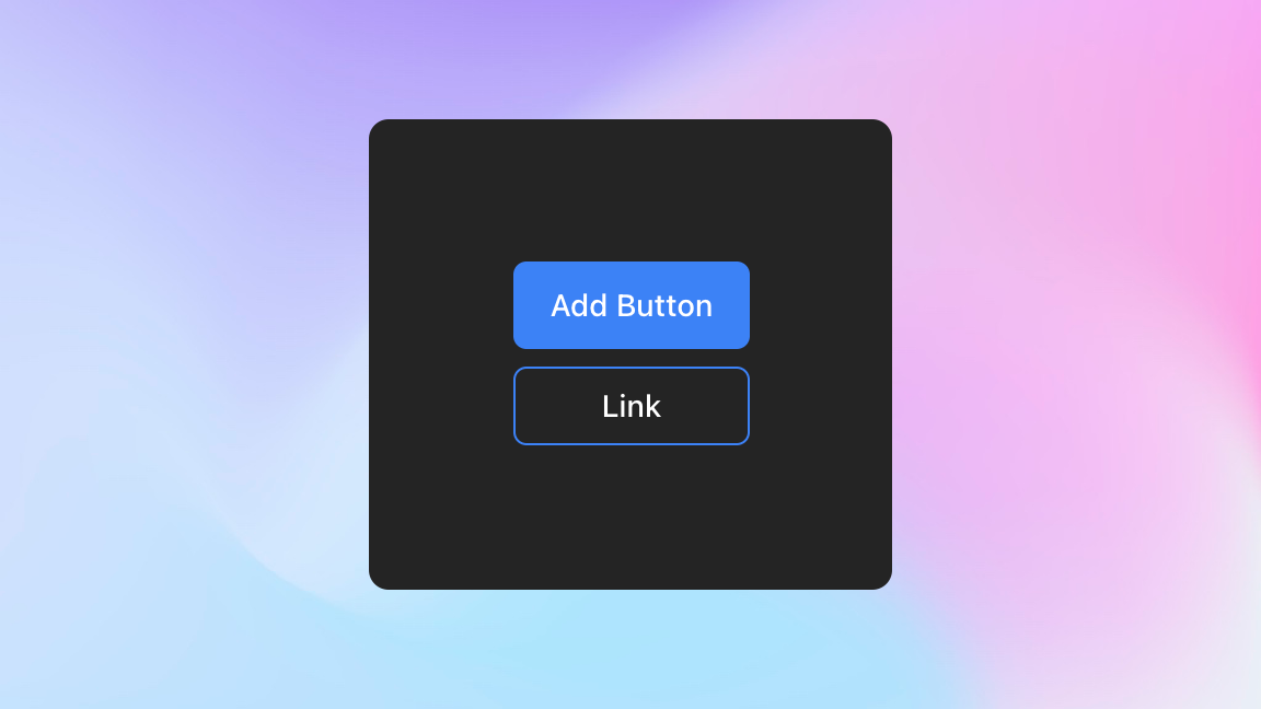
default: 'bg-blue-500 text-white hover:bg-blue-300',
outline: 'border border-blue-500 text-white hover:text-slate-300'
},
size: {
default: 'h-10 py-2 px-4',
sm: 'h-9 px-2 rounded-md'
}
},
defaultVariants: {
intent: "default",
size: "default"
}
);
At first, we declared a constant variable called buttonVariants whose value will be the output of cva function.
cva accepts two inputs first one is the base value and the other is the config object, in our case base value is a basic style class for the button component. And in the config object cva provides variants object in which we define our variants.
The first variant we have declared is called intent which contains two options default and outline and the second variant we have declared is called size which also contains two options default and sm and all those options contain some sort of style for the button component.
config object also gives defaultVariants object where you can choose the default style for your variants.
interface ButtonProps
  extends ButtonHTMLAttributes<HTMLButtonElement>,
    VariantProps<typeof buttonVariants> {}

const Button: FC<ButtonProps> = ({ className, size, intent, ...props }) => {
  return (
    <button
      className={cn(buttonVariants({ intent, size, className }))}
      {...props}
    />
  );
};
In the above code, we have declared a type for the component where we extend the built-in typescript type ButtonHTMLAttributes<HTMLButtonElement> to include all the HTML button attributes. VarinatProps is used to get all the variants type from buttonVariants.
After that, we defined a react functional component called Button which accepts the type of ButtonProps. Then we deconstruct these props where className, size and intent from VariantProps and all the remaining props from html button attributes.
As we return the button tag in the component and that button contains className property and in that property we call the cn function from the utilities. This cn function takes a parameter where we have passed buttonVariants with the required values inside it.
At the last, we have exported both the Button component and buttonVariants.
export { Button, buttonVariants };
The reason we have also exported buttonVariants is so that we can use those styles and variants anywhere we want to for example: using those styles in an anchor tag <a />.
Now if we use Button component anywhere in the app we can use those type-safe variants and get those options in autocomplete.
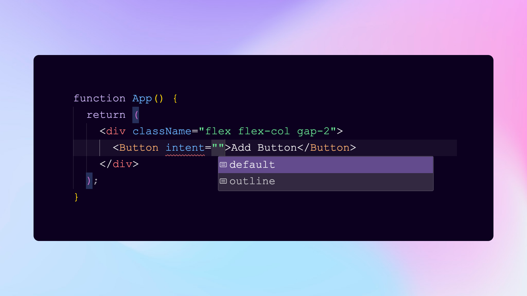
As you can see we can use buttonVariants from Button.tsx file to provide those variants and styles to an anchor tag.
<a href="https://google.com"
className={buttonVariants({ size: "sm", intent: "outline" })}
 >
    Link
</a>
Conclusion
By creating reusable components, development teams can increase efficiency and maintain consistency in their UI development. This allows for faster development and makes you focus on the right things.
My Twitter: Miral Suthar
Github repo: Variant-component
